It's also a grassroots communication device. The characteristics of grassroots communication are not only cheap and simple to produce without a lot of resources; also important is guaranteeing as much participation as possible. Newspaper-in-a-Box is not designed to be produced by an "expert" with high technology; rather it is meant to be produced by a group of people (see job descriptions but check page 29) with all jobs of equal importance.
The first step of producing a Newspaper-in-a-Box (Canadian patent file # 2,055,249-2) is to have a group discussion, preferably including a facilitator familiar with the process. That's why the first item in this guide is a list of discussion questions for the group.
Ideally to produce a grassroots newsletter, your group would work together with a facilitator to produce your own box. But included in this guide are many of the tip sheets from a typical Newspaper-in-a-Box kit.
Photographs are very important in grassroots newsletters. In the first place, it makes them much more visually interesting. Also photocopied black/white photgraphs can be of suprisingly high quality. We also scan color photos. Grassroots newsletters often reunite group members who haven't seen each other for a while, or who are separated by distance, and photos make for a much more personal contact.
Black and white photos reproduce better and they're cheaper if you do the processing yourself. Developing and printing by the group means you can size the photo and also choose what area of the negative you want to enlarge.
Photos are also useful to give to the mainstream newspapers for publicity purposes. Also you can use them in reports to funders or members.
The Newspaper Wall is another Ryakuga grassroots communication tool being developed. Physically it consists of large plywood panels hinged together and covered with cork. The panels are designed and laid out like newspaper pages with photos, graphics, stories and headlines.
(This guide was written in 1995. One interesting development is that the Newspaper Wall has evolved into online web discussion boards - Ryakuga Interactive. Newspaper-In-A-Box, like the rest of the online tutorials, research papers, rants and guides, is copyright. Please ask permission before any attempt at distribution.)
START-UP QUESTIONS
THE PURPOSE OF THESE QUESTIONS IS TO GET ENOUGH INFORMATION TO CUSTOM FORMAT YOUR NEWSPAPER-IN-A-BOX AS WELL AS TO FOCUS THE ACTIVITY OF YOUR GROUP WHEN YOU START REPORTING AND PRODUCING THE NEWSLETTER. A BONUS OF THIS PROCESS IS YOU WILL HAVE TO TAKE A SECOND LOOK AT THE AREAS OF EMPHASIS AND GOALS OF THE GROUP ITSELF.
1. WHO'S THE AUDIENCE? WHO WILL BE READING YOUR NEWSLETTER? HOW MANY READERS? WHERE AND WHEN WILL THEY BE READING? WILL THE NEWSLETTER BE SHARED?
2. WHO'S DOING THE WORK? HOW MANY STAFF MEMBERS? WILL THE SAME PEOPLE HAVE THE SAME JOBS FOR EACH ISSUE?
3. WHO DOES THE NEWSLETTER REPRESENT? A GROUP? A GEOGRAPHIC AREA?
4. WHY DO YOU WANT TO PUBLISH A NEWSLETTER? WHAT IN GENERAL DO YOU WANT TO SAY?
5. NEWSPAPER-IN-A-BOX IS RELATIVELY CHEAP TO PRODUCE BUT YOU WILL EITHER NEED SOME FUNDING FOR TAPE, PAPER AND PHOTOCOPYING OR DONATIONS OF MATERIAL AND SERVICES? HOW ARE YOU GOING TO GET FUNDING OR SUPPORT?
6. HOW OFTEN DO YOU PLAN TO PUBLISH? WILL YOUR SCHEDULE BE ACCORDING TO CHRONOLOGICAL TIME OR EVENT?
DO YOU HAVE ANY DEADLINES FOR WRITING STORIES OR PAGE
LAYOUT?
7. ONE SECRET OF MAINTAINING A SUCCESSFUL NEWSLETTER IS TO RECRUIT PEOPLE OUTSIDE YOUR STAFF TO SUBMIT LETTERS, STORIES, OPINION, DRAWINGS AND PHOTOS. WHO ARE THE PEOPLE IN YOUR COMMUNITY WHO CAN HELP?
8. WHAT IS THE NAME OF THE NEWSLETTER? DOES YOUR GROUP HAVE A LOGO OR INTERESTING DESIGN TO INCLUDE IN YOUR NEWSLETTER NAMEPLATE AT THE TOP OF THE FIRST PAGE? TAKE CARE CHOOSING A NAME AND DESIGN BECAUSE YOU ARE GOING TO BE STUCK WITH IT AS IDENTIFYING A SUCCESSFUL NEWSLETTER.
9. NEWSPAPER-IN-A-BOX PRODUCES A NEWSLETTER WITH A COMPARTMENTALIZED FORMAT. THIS MEANS CERTAIN PAGES WILL HAVE THE SAME TITLE OR "FLAG" EVERY ISSUE. THIS MAKES PLANNING AND EXECUTION EASIER; IT'S SORT OF LIKE "FILL IN THE BLANKS". WHAT REGULAR COMPARTMENTS WILL YOU BE CARRYING? SOME POSSIBILITIES ARE EDITORIAL; OPINION; SPORTS; LETTERS; POETRY; MESSAGES; COMING EVENTS; RECIPES; CLASSIFIED; ANNOUNCEMENTS; ADVERTISEMENTS; REVIEWS; FICTION; PHOTOS; "GEOGRAPHIC" AREAS SERVED BY THE NEWSLETTER, AND SPOTLIGHT ON CERTAIN PEOPLE OR GROUPS.
10. ONE CENTRAL FOCUS OF THESE QUESTIONS IS TO IDENTIFY THE VARIOUS INTERESTS AND AREAS OF CONCERN FOR THE GROUP PRODUCING THE NEWSLETTER. EACH INTEREST OR CONCERN IS RELATED TO A DESCRIPTOR WORD OR TITLE. THESE WORDS OR TITLES BECOME BOTH THE PAGE "FLAGS" WHICH COMPARTMENTALIZE THE NEWSLETTER, AND ALSO A FOCUS AND ENERGIZER FOR THE REPORTING WHICH BRINGS IN THE BASIC MATERIAL FOR THE NEWSLETTER. WHAT ARE THE INTERESTS AND CONCERNS OF YOUR GROUP? FIND THE BEST DESCRIPTOR WORDS TO EXPRESS THE INTEREST OR CONCERN. FOR EXAMPLE, ONE FLAG FOR A WOMEN'S NEWSLETTER COULD READ "FAMILY VIOLENCE".
COMMUNITY NEWS
News is ...
1. Important ...
2. Interesting ...
3. Controversial ...
4. Unusual ...
5. Happening right now.
6. Close by ...
... for members of the community.
JOB DESCRIPTIONS
Job descriptions are not to isolate people within their own exclusive job territory. Jobs should be shared. It's also important for each person to share experience and skills with others to ensure the sustainability and growth of the process and the group.
1. Publisher: Makes sure there is enough staff to do the job. Checks to see if the necessary tools and supplies are on hand. Keeps track of the different production stages of the newsletter until distribution.
2. Editor: Writes the editorial. Responsible for designing the editorial page. Makes sure stories and photos are chosen or assigned.
3. Page Designers: Review the material - stories, photos and ads - and design the pages. This job may be divided up so each page is designed by a different staff person or the editor can design all pages.
4. Community reporters/correspondents: In grassroots communications, it's important to have as many people as possible contributing. Reporters can represent any community - geographic or common interest - belonging to the volunteer group. Reporters can choose to write stories on topics of their choice or they can agree to be assigned events or subjects to cover. It's best to write stories in three-inch wide columns for a standard size newsletter.
5. Photographers: Good black/white photos are important in turning out an attractive Newspaper-in-a-Box. The photos should be printed to size of your columns (three inches wide or six-and-one-half inches wide for a standard Newspaper-in-a-Box). Ilford makes a quasi black/white film which can be processed in the commercial computerized labs; five inch wide enlargements can be pasted up within borders. Color photos can be used but they tend to go dark (unless you use a scanner; cut out and tape in the prints).
6. Darkroom person: Darkroom work is an easily acquired skill. In many communities you can find people who process photos as a hobby. If not, check for high school clubs or, in Canada, air cadet labs.
7. Photocopier-Collater: Practice with the darkness control to get the best result with photos and no black lines. Check how you have to load the tray to photocopy the other side of the paper (for example, page two on the other side of page one); sometimes the pages have to be reversed top to bottom. You can also create larger type for ads and headlines by using the photocopier enlarging control.
8. Page Layout people: It's really important to take time and lay out the pages so they are neat and straight. Use rulers and pasteup guides to make sure the pages are straight both vertically and horizontally. All edges should be covered with magic tape (ordinary scotch tape won't work ). You don't have to cut really close to the tape.
9. Advertising people: It is possible to raise revenue for newsletter by selling advertising. Design simple ads (you can use business cards) and use your photocopier creatively. You can also publish regular "ads" for different fetures of the volunteer group. These ads can be photocopied on transparencies and reused for each publication.
10. Circulation person: Circulation decisions include- Whether or not to sell the newsletter and for how much? How to handle mailouts? How many newsletters to produce? Who should receive the newsletter anyway?
11. Typists: Typists are essential but it's a good idea to ask contributors to type their articles or letters in three inch columns for standard newsletters to save work. Try to enlist as many typists as possible. It's a burnout job on volunteer newsletters.
12. Cartoonist: Drawings, especially those featuring local personalities, add color to your newsletter and take pressure off producing photographs.
COVERING MEETINGS TO GET INFORMATION
If you are going to cover a meeting, try treating the event as would a professional reporter.
1. Bring a steno pad and a few pens.
2. Arrive early.
a) you may pick up news tips talking to participants.
b) you need time to make a sketch of the table and write in names and titles of participants.
3. Date the meeting; when it starts, write the name of each speaker. If person speaks from the floor, make sure you find out name and title.
4. You're after all the quotes and expressions of opinion you can get. Try to write bits of conversation rather than use your own words.
5. Use abbreviations as much as possible, eg. NF, C'brook, St. J's, prov, gov, pres. Make up your own abbreviations.
6. Get your facts right before you leave the meeting. Double check dollar figures and passed motions.
7. Use a different color pen to circle or underline quotes that seem to be important during the meeting. Put big questions marks beside items you want to ask questions about.
8. Meetings are often places you can pick up information to develop as stories later on. Keep your ears open.
9. Keep your old steno pads.
NEWSLETTER/NEWSPAPER DESIGN
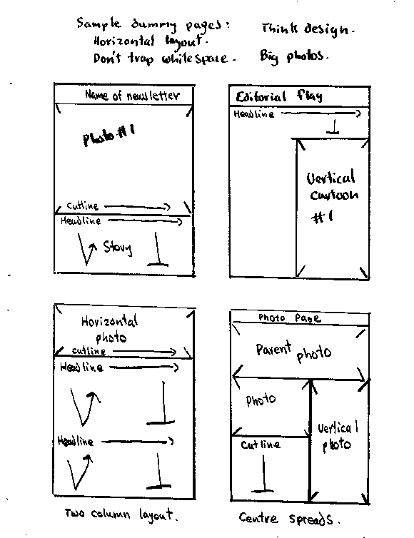
Let's use an 8 1/2 x 11 photocopied newsletter as a design problem.
Use dummy pages to design your newsletter. Check out the sample pages and use a broad marker to arrange your stories and photos in a pleasing design. Mark in the size of photos and the first few words of the cutline/headlines. You have been given page "flags" so you can "departmentalize" your newsletter according to content categories. Your dummy represents a page 8_ x 11; it begins vertically one quarter inch below the folio line and ends one half inch from the bottom of the page.
Newspaper tradition demands a separation of news and editorial content.
This means that your reader can expect news stories to be objective and true while editorials state the way the newspaper thinks things should be.
Another separation is the difference between editorial and opinion. Generally speaking, an editorial identifies a problem and suggests a solution. Opinion articles are just that, and should be placed on separate pages.
This may seem like nitpicking but your newsletter will gain more credibility if you can manage to effectively (and obviously) separate fact and opinion.
The editorial page can also include a "masthead" which lists editorial policy, staff and ownership of the newsletter. Maybe you can also find a cartoonist to produce art for this page.
It would seem appropriate for a participatory communication newsletter to contain as much input as possible from your readers. This could range from the entire newsletter to special pages for this purpose.
While remembering to keep it simple, have fun and be inventive designing your newsletter.
As Keith Pearson says: If it looks good, then it is good.
NEWSLETTER/NEWSPAPER LAYOUT
Cut out the nameplate and place it evenly on an 8 1/2 x 11 piece of paper one-quarter inch from the top of the page. Type out the date of issue and tape it on the nameplate. (Magic Tape works best.)
Choose your best black/white photo and tape it on the page one-quarter inch below the bottom border of the nameplate.
Type out the cutline for the photo with 6 1/2 inch wide margins and tape it below the photo.
If there's room for a story, Letraset the headline one-quarter inch below the cutline.
Your stories should be carefully edited for misspellings (Oxford English Dictionaries and Canadian Press Caps and Spelling/ Styleguides are recommended) before they are typed or computer-printed three inches wide for standard newsletters.
A computer printer will automatically sort out your story to equal the length of the lines according to the right margin. However, it's a bit more complicated with a typewriter.
It's probably better to set your margins about 2 5/8" wide (use a ruler). This means you will usually have time to finish typing any word after the bell rings. Experiment! Theoretically the lines of your story should be
straight across the page in two columns.
For the purposes of a community newsletter, it may be too difficult to ensure all lines of the story are straight across two columns.
But you can make sure the first and last paragraphs are straight. Cut your stories between paragraphs to space out the story to fit the space.
Other pages after page one need a folio line taped on the page one-quarter inch from the top.
Exceptions will be pages with flags, such as the editorial page.
A Newspaper-in-a-Box kit includes an editorial flag.
Cut out the appropriate flag and magic-tape it on the page one-quarter inch from the top.
Type out a page number and magic-tape it on the flag at the outside corner of the page. The right-side is the outside corner for odd-numbered pages and the left-side is the outside for even-numbered pages.
Layout for the rest of the pages of your newspaper works the same as page one.
Take your time and try to ensure your pages are neat, straight and even.
Print - page ten
To rephrase a pop-video rule, the time not spent being careful about layout, will be spent apologizing after publication.
Sloppy layout means your reader will simply doubt the truth of what you print. Sloppy spelling, especially of people's names, has the same effect.
Layout is greatly simplified with a light-table.
A light-table is a box with a glass top and light inside. On top of the glass, you can tape a page of horizontal lines and vertical lines on the edges of the columns. If your layout page is taped on straight, it's relatively easy to ensure, using a ruler, that your columns, photos and headlines are straight both vertically and horizontally.
Even if you use a piece of plywood instead of a light-table, taping a piece of paper (bigger than 8 1/2 x 11) upon which you have drawn strong, black vertical and horizontal lines, will help your layout process.
Putting together a newsletter is a participatory exercise. Some people write; some people edit - but all their efforts won't achieve communication potential unless you can locate people who enjoy putting together a neat, readable page.
CUTLINES AND HEADLINES
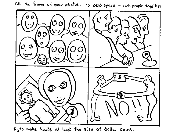
Newspaper photos are about people. The purpose of a cutline is to identify the people in the photo and explain what they are doing. Make your cutlines interesting and don't restate the obvious. Don't say "sitting here are..." but say what the people are doing.
Identify first the person on the left by using [left] immediately after the person's name but before age and place. As far as possible, all people in the photograph must be identified by title [eg. student, carpenter], name and place. Credit for photographer should be placed in brackets at end of cutline.
[Jones photo].
Headlines should be thought of as a hook to entice the reader to read the story. Be inventive - for example, try using alliteration. Headlines are written in a style which usually leaves out passive verbs and unessential words.
Use active verbs. For example, don't say - A boat was rammed by a whale; say - whale rams boat. Wherever possible, use the present tense. Use capitals as you would in ordinary sentence structure. Don't use abbreviations - especially when people won't understand.
Try to find your head in the lead (first sentence) of the story. If you can't the lead should probably be rewritten (with beginners, the lead is most often the last sentence of the story).
Centre the head above the story. If the story includes a photo make sure a few lines of type are placed above the photo before you run your head above the photo.
Newspapers often have head count sheets to let you know how many characters of each type family and size will fit over so many columns.
Definitions
Point size: The size of the characters (72 points to an inch).
Font: The family of typeface; also whether the type is bold, light, medium or the same in italic (slanting letters).
There is a method using a typewriter to determine if your head will fit the space. Consult head sheets for point sizes and counts. Write point size and font (bold/light/italic/etc) on one line: carriage return: type correct number of x's: carriage return: type a letter under each x: carriage return and keep trying until you get the head and count you want. Heads are centered but should not exceed or be less than the correct count by more than two or three letters. Avoid labels, abbreviations, verbs such as 'is' and 'are'. Make heads active rather than passive. Kickers for a thirty-six point bold roman head should be eighteen point light italic, i.e., half size and reverse of the head.
PASTEUP HINTS
Some people love pasteup; some people hate pasteup. But it has to be done and sloppy pasteup will nullify all the work that's gone into writing good stories and processing great photos.
It's a lot easier to pasteup if you have a light box or a drafting board and T-square.
If you don't, take the pasteup guide and tape it to a piece of bristol board or cardboard. Tape another 8 1/2 x 11 sheet on top of the pasteup guide.
The horizontal lines on the pasteup guide are helpful in keeping your headlines, photos and copy straight on the page.
Don't paste anything outside the vertical lines. That is, all copy and photos fit inside the vertical lines which are 6 1/2 inches apart. The vertical lines are the outside edges of your page.
Horizontally the page starts one-quarter inch from the top and ends one-quarter inch from the bottom.
First tape your folio lines to the pages.
Photos are difficult to cut. Use a razor cutter and place your ruler as a guide on the inside of the cutter. Cut your vertical sides first. Photos are often taped on last (cut them last to fit).
Cutlines are 6 1/2 inches wide for standard newsletters- like the photos. Cut them out and tape them below the photo.
The stories - or copy - will be typed on columns 3 inches wide. Tape them on the page so the lines are even and each column begins and ends on the same line. To make your story space out even only cut between paragraphs.
You may have to throw away a few paragraphs to make your story fit.
If you use Letraset sheets, be careful to ensure your headlines are straight. The plastic pocket-holder/nib from a ballpoint pen cap works well for rubbing the Letraset in order to transfer it to the page.
After pasteup simply photo-copy the pages with page 2 on the back of page one and so on.
For standard size newsletters, you'll get a better product if you use 11 x 17 paper and tape four of your original pasteups to both sides of the 11 x 17. When you finish photocopying, simply fold the 11 x 17 to get your pages. No stapling is required.
But be careful which pages you assemble together.
Have fun!
THE LAW
You and for whom you are writing can be sued for libel.
Libel is a false statement which damages a person's reputation or standing in the eyes of "right thinking men and women".
A true statement which damages reputation is not libellous. A false statement which does not damage a reputation is not libellous.
Investigative journalism is an important activity in modern society.
But you should be aware it is not a defence against libel to quote a libellous statement or to use quotation marks. Using "alleged" or "allegedly" won't help either.
If you find you have inadvertently made or quoted a false statement which may be considered libellous - APOLOGIZE IMMEDIATELY. The apology should be made in your media with the same weight as the original false statement. If the false statement was carried on page one, so should the apology.
FAX NEWSLETTERS: DIFFERENT SIZE
Then the smaller size (based on a folded lengthwise legal size paper) appealed to other grassroots communicators. It also means you can fold the eight and one half by fourteen inch paper without stapling.
So... please note all measurements given in this guide were for the standard eight and one half by eleven inch newsletter. If you want to do the smaller newsletter, please substitute these measurements.
The page is laid out five inches wide and seven and one half inches deep. The folio line is placed at the top or bottom one half inch from the edge of the paper. The first column starts one inch in from the left edge.
Each column is two and one quarter inches wide with a half inch gutter. This means photos are printed either five inches or two and one half inches wide.
ASSIGNMENT SHEET
REPORTER:
WHO?
WHERE?
WHEN?
WHAT SUBJECT?
EDITOR:
PUBLICATION:
DATE OF PUBLICATION:
PAGE:
DEADLINE:
WHEN COMPLETED:
NEWSPAPER-IN-A-BOX SUPPLIES CHECK LIST
BR>
| ITEM | SOURCE | AMOUNT |
| PHOTOCOPIER PAPER | ||
| TONER | ||
| RIBBONS/CARTRIDGE | ||
| WHITEOUT | ||
| MAGIC TAPE | ||
| BORDER TAPE | ||
| BORDER CORNERS | ||
| DUMMY PAGES | ||
| LETRASET | ||
| PENCILS | ||
| FINE MARKERS | ||
| STENO PADS | ||
| GESTETNER STENCILS | ||
| GESTETNER INK | ||
| PHOTOGRAPHIC PAPER | ||
| PAPER DEVELOPER | ||
| PAPER FIXER | ||
| BLACK/WHITE FILM | ||
| FILM DEVELOPER | ||
| FILM FIXER | ||
| PHOTOFLO | ||
NEWSPAPER-IN-A-BOX EQUIPMENT CHECK LIST
| ITEM | SOURCE | AMOUNT |
| COMPUTER | ||
| PRINTER (LASER) | ||
| PHOTOCOPIER | ||
| GESTETNER | ||
| T-SQUARE | ||
| RIGHT ANGLE TRIANGLE | ||
| RULER | ||
| SCISSORS | ||
| LINE GAUGE | ||
| X-ACTO KNIFE | ||
| TAPE DISPENSER | ||
| LETTER STENCILS | ||
| TYPEWRITER | ||
| CORD CADDY/EXTEN. CORDS | ||
| TABLES/DESKS | ||
| LIGHT TABLE (BOX) | ||
| ENLARGER | ||
| TIMER | ||
| PAPER SAFE | ||
| SAFETY LIGHT | ||
| TRAYS | ||
| CHEMICAL BOTTLES | ||
| BULK FILM LOADER | ||
| FILM CANNISTERS | ||
| DEVELOPING TANK | ||
| DEVELOPING REELS | ||
| THERMOMETER | ||
The ability to produce black and white photos is almost essential for community newsletter people who want to make grassroots community communication.
These skills are also useful for community groups desiring access to mainstream publications. Try to include an interesting black and white photo with each press release. Identify and give assignments to your group photographers. In rural areas, it is often difficult for understaffed media to attend every event.
Black and white photos are best because they reproduce much better. Colur photos tend to be very dark when reproduced in newspapers or magazines. Colour photos in magazines are shot as slides and then put through an expensive process of colour separation.
Check out the photo tip sheet and frame your shots carefully. Get in close.
If using the standard Newspaper-in-a-Box kit, make your photos either three inches or six and one-half inches wide. (You can use a border around smaller commercially reproduced photos.) Experiment with the exposure (lightness/darkness) control before copying a bunch of pages including a photo.
Photographs can add extra appeal to photocopy posters or lampoons (satirical posters). Just use scotch magic tape to stick the photo on your original copy.
If you decide to make black and white photography a go, the first step is to access a darkroom - whether it's in a high school; air cadet lab; local photography business, or a private home. Keep looking - there's lots of darkroms around, often unused.
It can be difficult to find black and white film; buying bulk film and rolling your own is cheaper and can provide constant access. Also you can roll as many frames as you need; you don't have to shoot a whole roll for one photo.
NEWSPAPER PHOTO TIPS
2. Take photos of something happening/people doing things - not photos of big groups/people standing staring at the camera.
3. Technical problems aside, bad photos are generally caused by:
(a) Poor focusing - practise with an empty camera, quickly focusing on random objects.
(b) Standing too far away from the subject - get closer, shoot the subject not the background.
(c) Never changing point of view - many people shoot as if their bodies are old fashioned tripods; kneel, shoot from an angle - stand on a chair.
(d) Not aiming at the subject - pay attention to what you want in the viewfinder - the action.
(e) Lack of pre-visualization; the photographer has no idea of what he/she wants the printed photo to look like - plan your shots.
4. Summary - newspapers are about people; make in-close shots of people doing things your photographic aim.
(thanks, Gwen)
2. Put negatives in negative carrier shiny side up and upside down.
3. Turn enlarger on and open lens to brightest.
4. Move lamphouse up or down for desired print size.
5. Turn focusing knob until picture comes sharp: use grain focuser.
(See tip sheet.)
6. Stop lens down two clicks. f11 or f8.
7. Turn off enlarger.
8. Use a test strip to determine correct exposure time. (See tip sheet.)
9. Slide exposed paper into developer face down, push under, rock tray.
10. Turn paper after 20 seconds, rock tray, don't remove print.
11. Develop 60 seconds or pull if desired.
12. Pick up and drain: print is still developing.
13. Agitate print in stop bath or water for 30 seconds.
14. Place print in fix face down and agitate.
15. After 1 minute print can be inspected in outside room. Carry in tray
to prevent dripping.
16. Wash prints 5 minutes.
17. Squeegee and hang to dry.
DEVELOPING FILM
We use Kodak T-Max or D76 or HC-110 or Acufine developers. The manufacturers have specific times for development according to the type of film used (we use 400 ASA T-Max or Tri-X or HP-5) and the temperature of the chemicals. Twenty degrees centigrade or 68 degrees fahrenheit is the magic (best) temperature in the darkroom. All chemicals and the water should be within several degrees of each other or the print definition will look like lumpy sand (not good). We use water instead of stop bath and Rapid-Fix (2-4 minutes). Read your manufacturers' instructions.
Don't carry the tank around during development - the heat from your hands will warm the chemical.
1. Warm up chemicals by running water over the bottles to about 20_.
2. Set water temp to same as chemicals.
3. Run water thru tank for about a minute.
4. Check the manufacturers' developing time.
5. Start clock when developer is in tank.
6. Tap tank to get rid of bubbles (don't break it).
7. Agitate 10 seconds. Turn the tank upside down twice.
8. Agitate for 5 seconds every 30 seconds. Turn the tank upside down once.
9. Pour developer back in bottle after time is up.
10. Run water through the tank for about a minute.
11. Fix for 3 minutes. Tap tank to get rid of bubbles. Agitate continuously.
12. Wash for 20 minutes.
13. Agitate in Photo flo for 1 minute.
14. Hang film to dry (put a clothes pin on the bottom to hold it straight).
Don't squeegee the film.
15. Handle dried film very carefully to avoid scratches.
THE TEST STRIP
A test strip is a piece of scrap photo paper exposed for different times, then developed so you can choose the best time according to the images on the strip.
First set up the enlarger ready to print. Use a grain focuser.
Put test strip in easel shiny side up. Expose the whole sheet 3 seconds. Cover four-fifths of the sheet with a piece of cardboard. Expose two seconds. Uncover another fifth. Expose five seconds. Carry on this process until you have exposed the entire piece of paper in strips.
Your exposure times will be 5 seconds; 10 seconds; 15 seconds; 20 seconds and 25 seconds. Your print will probably be properly exposed within these times.
If it's too dark, the time is too long. If it's too light, the time is too short. If you're not sure, then try another test strip of different times.
Print - page twenty-four
Note: There are other methods of making test strips. The paper we use costs about one dollar for each sheet - test strips save money.
THE GRAIN FOCUSER
If you don't have a grain focuser - concentrate on eyes, hair, denim or tweed. These kinds of objects are easy to focus.
Set the eyepiece by looking through it at a light. Loosen the set screws and adjust it so the line (looks like a glass rod) is sharp.
Focus the enlarger with the lens fully open (the brightest image).
First focus the image by eye so it's approximately correct.
When the enlarger is exactly focused, the image in the grain focuser will appear to be composed of tiny, sharp grains of sand. Small movements of the focusing wheel will put the image in and out of focus.
It takes a while to get used to the grain focuser but it's worth it for consistently sharp prints. Another benefit is that you won't waste time trying to focus sharp images from an out-of-focus negative.
DEVELOPING FILM WITHOUT MUCH RUNNING WATER
This method is based on collecting a few clean jugs full of water at either 20 or 22 centigrade. Now, the Paterson tanks are supposed to only need ten ounces of solution for each film but we mix fifteen for one film and twenty-five ounces for two films. We're now using T-Max developer as a one-shot
Print - page twenty-five
(onetime use - throw out) solution mixed at four parts water to one part chemical.
Note: you may have to use ice in a bucket to keep the chemicals and water cool enough in some climates.
So we first put water in with the film for about a minute. Pour out the water and add the developer (note the time) - T-Max developer likes vigorous agitation for five inversions for five seconds total every thirty seconds. Remember to tap the tank to get rid of air bubbles.
400 ASA Tri-X is developed for 6 minutes at 20C. and 5.5 minutes at 22C. 400 ASA T-Max is developed for 7 minutes at 20C. and 6.5 minutes at 22C.
Then empty the developer into a container to get rid of and fill the developing tank with water (at the same temperature). Or you could use stop bath for 30 seconds. Dump out the water after a minute.
Then fill the tank with Rapid Fix - tap the tank and agitate it constantly. Times are two to four minutes for Tri-X and three to five minutes for T-Max film.
Put the fix back in its container to use again and fill the tank with water for about a minute. To save water we now use hypo clear (one package makes one gallon). Put hypo clear in the tank for two minutes. Then put the tank under slowly running water for ten minutes. Then wash the film for about a minute with a weak solution of photo-flo (one half capful in a litre of water).
Hang the film to dry where there's no dust.
ASSIGNMENT SHEET
EDITOR:
PUBLICATION:
PAGE:
SUBJECT:
TIME:
PLACE:
PRINT DEADLINE:
SIZE OF PHOTO:
SPECIAL INSTRUCTIONS:
Democratization
One way is to divide the roles so people can work according to their individual job descriptions.
In 1994 at the Caribbean Federation of Youth camp, an entirely different process evolved. First, a goal emerged of including all voices of all participants.
Next, it was decided that it wasn't necessary to have official jobs. What was important was to try to stimulate everybody to take part - to have a voice.
Other components of the process included voting on the front page photograph and all other photographs in the newsletter.
Typing stories and pasteup were carried out by people who wanted to do it.
The result was SA KA FET - a 36 page full-size newsletter of all the voices.
There are lots of different processes, but it seems one danger of job descriptions is that they promote hierarchialism by which some people assume roles as "leaders" thinking that they are better than everybody else.